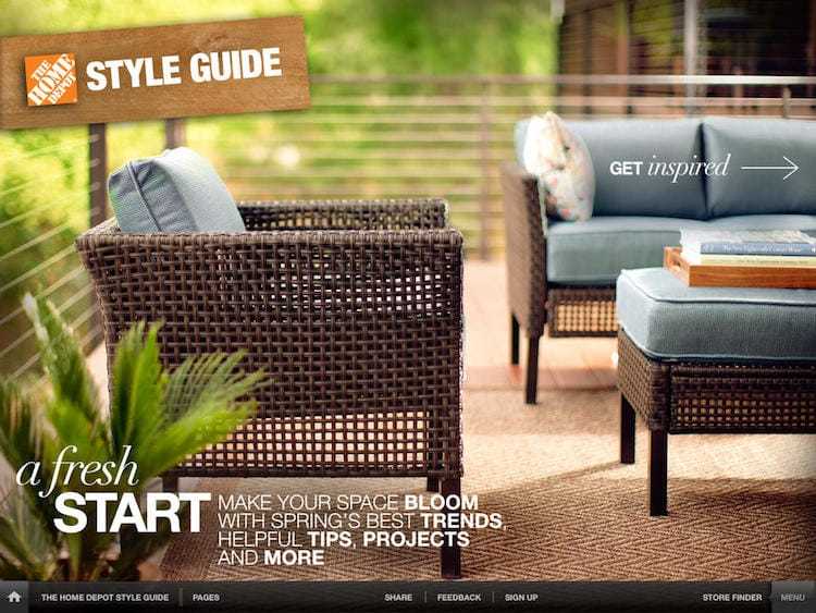
The Home Depot partnered with MaxMedia to create a multi-channel experience giving a distinct point-of-view in the market of home décor while promoting a fun, engaging, and non-intimidating environment for users.Chick-fil-A
This was the first catalog styled app I got to work on. It was based off seasonal ideas so we were putting out an issue every 3 months or so. I was lucky enough to do all of the development for three of the seasons.
The first issue I developed was the fall style guide:
In the fall guide I was able to play with a lot of fun functionality such as in view Video as well as a lot of page build ups.
In the holiday style guide we got to play with a small amount of "VR" as well as hid some easter eggs. The video doesn't show it but in a specific view (the one where you can slide horizontally) if you shake the iPad, it would create a snow storm!
You can view all of the other features here:

The final issue we produced was really fun. We added more of the VR aspect as well as added some 360 degree views of sheds. We added a different form of tiling views to help with loading of the app (as we added more imagery the size had began to bloat a bit which was another challenge we had to overcome).
You can view the spring guide here:

